

Badges are for reading across a table
At a conference, a name badge is read at a glance, usually from a metre or two away and often while someone is moving. That changes how it should be designed: it needs to be clear and quick to read rather than detailed.
Make the name the biggest thing
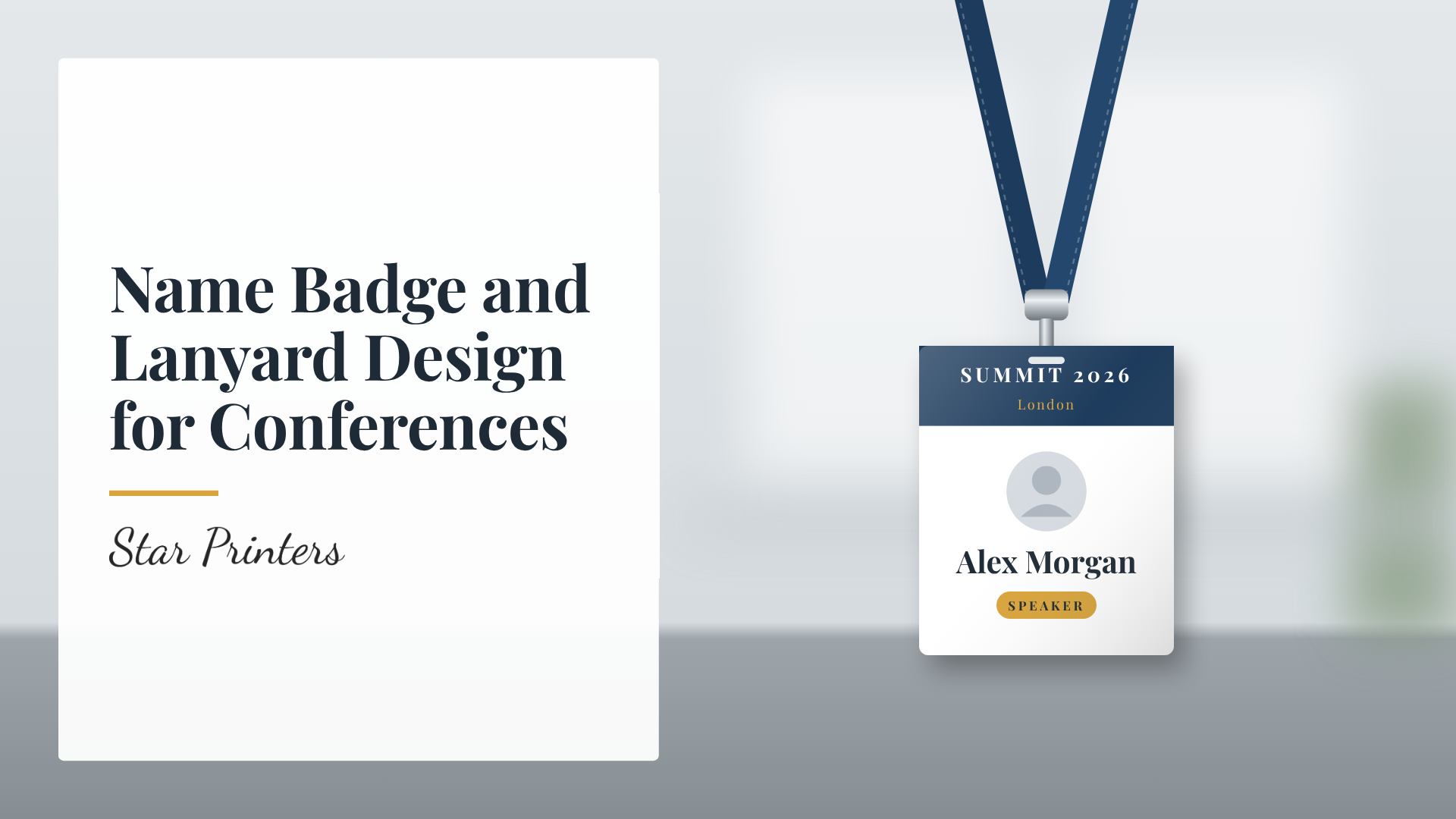
The attendee's name should be the largest and boldest element. A first name in large type is often the most useful, since it's what people actually use in conversation. Job title and organisation can sit underneath in smaller text. Avoid small, thin or decorative fonts, which are hard to read on a moving badge.
Keep branding light
Your event name or logo belongs on the badge, but it shouldn't compete with the name. A small logo and a clean colour scheme look professional without making the badge crowded.
Colour coding
If you have different groups of attendees, such as delegates, speakers, staff and exhibitors, colour coding on the badge or lanyard helps people and security identify them quickly. Keep the number of categories small so the system stays easy to understand.
Orientation and the lanyard
Badges that flip round on the lanyard show their blank back, which defeats the point. Think about whether to print on both sides so the name is visible whichever way the badge hangs, and choose a badge holder size that suits the card you're printing. A lanyard in your event colours helps tie the look together.
Collecting the names
Get a final, checked list of names, titles and organisations early, and proofread it. Name badges are one of the easiest places for typos to be noticed. It's also sensible to order a few blanks for last-minute attendees and corrections.
Getting your badges and lanyards printed
Star Printers prints name badges and lanyards at our Tooting shop. See our lanyards and name badges, wristband and entrance ticket pages, browse all printing services, or contact us with your event date and numbers.